Korea Pooling ENG Branding / 코리아 풀링 이엔지 브랜딩
Pooling Korea ENG offers numerous services, including installing and changing cables and renting out equipment. I worked on their brand identity, logos, color palette, typography, and pattern. Check out their blog with the link below!
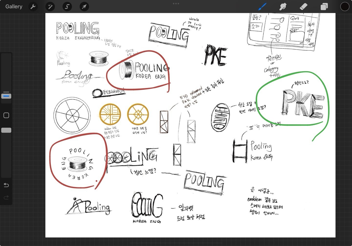
Brainstorming
After getting information, photos, and videos about the company, I asked if there was a specific aesthetic they wanted to pursue. Since they wanted a more sophisticated, premium aesthetic and something that shows what they do, I went ahead and did sketches that were in a circular shape, so it reminds people of the cable drums.


Color Palette
While drafting the logos, I looked back at the conversation I had with the client to figure out the colors for the brand. Earthy colors like dark green and gold were the colors we thought would work best and give a sophisticated and luxurious feeling. Below are the inspos and the color palette that I made.

Final Logo


Typography
Typography system is another important part of branding since it shows the personality through the fonts. Because pooling is a labor-intensive process that requires a lot of dedication and a sharp eye for detail. I thought a serif header paired with a sans-serif would show that personality.

Logo
After talking with the client, I was able to figure out the direction of the logo and went ahead finalizing the logo.


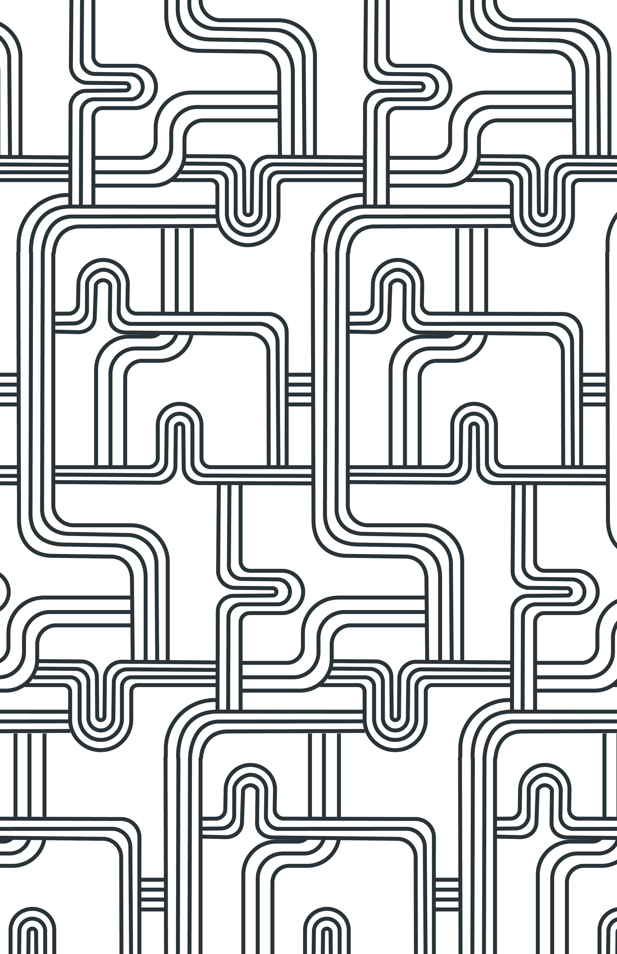
Pattern
For the pattern, I wanted to create something that was abstract but felt like cables. I thought keeping it simple with minimal colors would work best. One was created with the dark green color as the main, and one reversed.


Other
After finalizing the brand identity, the client wanted to design a vest for the employees with the logo. Below is the design for the vest.


Jan - May 2025
Brand Identity, and designs by Jhulee Park